Behaviour Tab User Interface
The Behaviour Tab is the main place for creating behaviours. It can be accessed by clicking the Behaviour tab on the Project Header. As shown in figure below, the Behaviour Panel is consisted of 3 main parts:
-
Toolbar: contains buttons to perform various actions in the Behaviour Panel
-
Sidebar: hosts the behaviour blocks library and the user-defined behaviour group list
-
Graph Panel: the primary workspace to construct object behaviour
Toolbar
The Toolbar hosts 7 buttons for your quick access to various behaviour management functions:
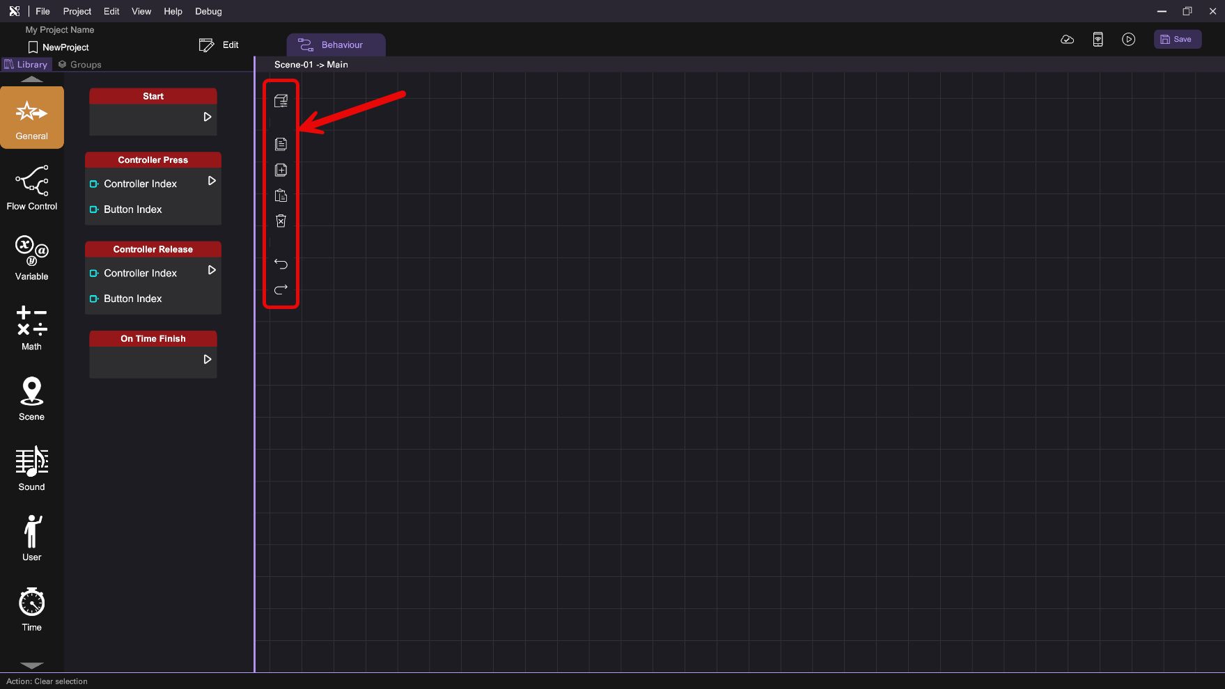
| Icon | Name | Description |
|---|---|---|
 | Show Item Variables | Open the "Item Variable" panel. |
 | Copy Behaviour | Copy selected behaviour blocks from the panel. |
 | Paste Behaviour | Paste previously copied behaviour blocks on the panel. |
 | Remove Behaviour | Remove selected behaviour blocks from the panel. |
 | Undo Last Step | Cancel or reverse the last action in the Behaviour tab. |
 | Redo Last Step | Redo the last action in the Behaviour tab. |
 | Remote Trigger | Setup a remote interface to trigger behaviour. (add-on feature) |
Item Variables
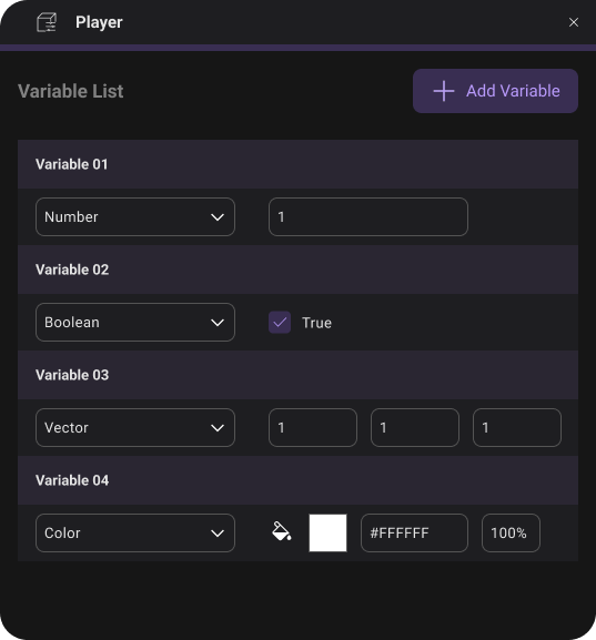
Item variables provide a mean to store and record some simple data in play mode. Created variables can be assessed by Variable -> Get/Set behaviour block. Press "Show Item Variables" to open the Variable Panel to manage the variables of the selected object.
The Variable Panel consists of three main components:
-
Variable Owner: Displays the owner of the list of variables.
-
Variable List: Shows the list of variables defined for that object. User can rename, delete, or set the variable type and default value for each variable defined.
-
Add Variable: Click to add more variable items in the variable list above.
You need to define the type and default value for each variable. A variable can be either a Number, Boolean, Vector or Color, with a default value correspond to the value of the variable when it first initializes during gameplay.
Sidebar
The Sidebar hosts the behaviour block library and the user-defined behaviour group list in two tabs, you can click on the "Library" and the "Groups" tab to switch between the two views.
Behaviour Blocks Library
Behaviour blocks are organized into several categories and color-coded according to their respective category. You can click on different categories in the Library view to access all behaviour blocks under that category.
Below is a list of behaviour block categories accessible by all object types:
| Icon | Description |
|---|---|
 | Provides behaviour blocks as a starting point to trigger execution, including scene starting and controller event. |
 | Provides behaviour blocks for sound controls, including playing and pausing. |
 | Provides behaviour blocks for scene controls, including fading effect transition and scene changing. |
 | Provides behaviour blocks for user controls, including user movement and travel destination. |
 | Provides behaviour blocks to control the execution flow, including branching, looping, and waiting for a certain condition or amount of time. |
 | Provides behaviour blocks to measure time, including timer and stopwatch control. |
 | Provides behaviour blocks for controlling variables including get and set scenes and item variables. |
 | Provides behaviour blocks for math-based operations, including value assignment, mathematical calculation, and logical control. |
There are also object-specific behaviour blocks only accessible by objects of certain types:
| Icon | Available Object Type | Description |
|---|---|---|
 | All object types except Scene | Provides behaviour blocks that use item interaction to trigger execution, including pointing, touching and clicking object. |
 | All object types except Scene | Provides behaviour blocks that perform an action on the chosen object, including move, rotate, and scale. |
 | All object types except Scene | Provides behaviour blocks related to display effect on an item, including outline, overlay, and blinker. |
 | All object types except Scene and Light Object | Provides behaviour blocks related to physical interactions. |
 | 3D Model | Provides behaviour blocks to control model, including animation, material and grabbing. |
 | 2D/3D Image | Provides behaviour blocks to control Image object, including setting image. |
 | 2D/3D Video | Provides behaviour blocks to control Video object, including pause and stop video. |
 | Document | Provides behaviour blocks to control Document object, including changing page. |
 | Text | Provides behaviour blocks to control Text object, including setting text. |
 | Character | Provides behaviour blocks to control Character object, including motion and voice. |
 | Option Box | Provides behaviour block to hide option box. |
 | Light | Provides behaviour blocks to control light. |
 | 2D Slideshow | Provides behaviour blocks to control 2D slideshow. |
 | 3D Slideshow | Provides behaviour blocks to control 3D slideshow. |
 | Button | Provides behaviour blocks to control button object, including setting button's color. |
 | Empty Object | Provides behaviour blocks to control collider of the empyty object as wall. |
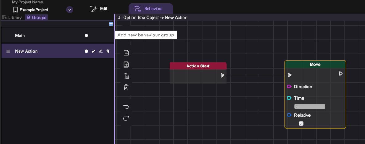
Behaviour Groups
To view the behaviours within a specific group, click on its name from the list, and they will be displayed on the graph panel. All groups, with the exception of the 'Main' group, can be renamed, reordered, or deleted by clicking the corresponding icon. During gameplay, behaviours in higher-ranked groups take precedence and are executed first. There are also two icons representing similar functions: Toggle Active and Toggle Action. Clicking the 'Toggle Active' option could enable or disable this Action layer, while clicking the 'Toggle Action' icon could control whether the Action Start block appears.
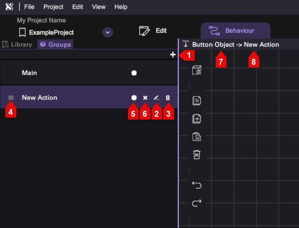
| Number | Description |
|---|---|
| 1 | Add new behaviour group |
| 2 | Rename |
| 3 | Delete |
| 4 | Drag to reorder |
| 5 | Toggle Active |
| 6 | Toggle Action |
| 7 | Object Name |
| 8 | Group Name |
Graph Panel
You can drag-and-drop behaviour blocks into the Graph Panel and link them together to create behaviours. The top of the Graph Panel shows the name of the object and the behaviour group you are working on. Details of creating behaviour in the graph panel will be discussed later in the "Building New Behaviour" section.