Inspector
Press "Inspector Tool" () (I) in the top menu or press "Inspector" under the "View" tab in the drop-down menu to toggle the inspector panel. The panel displays the detail of the selected object and allows you to modify various object properties. Some special objects have more unique settings that can only be accessed through the panel.
Common Configuration
Some configuration settings are common among all objects.
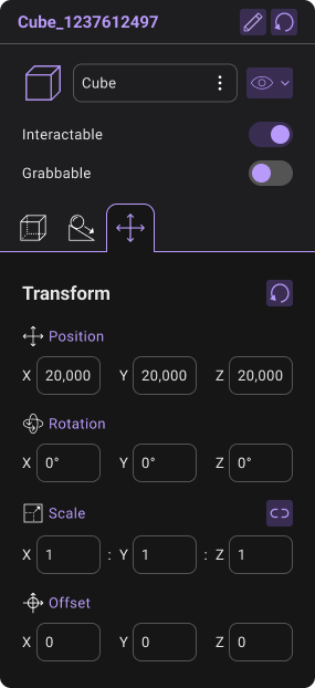
- Basic Information: The panel allows the user to change the object's name and modify the object transform values directly. Press "Rename" () and type to rename the object.
to precisely modify object transform, select the corresponding text box and enter the new value in the box.
-
Hide In Play: You can toggle the "Hide in Play" option to disable the object in Play Mode. If "Hide in Play" is enabled, the object cannot be interacted with by the user directly in Play Mode.
-
Hide in Editor: You can toggle the "Hide in Editor" option to disable the object in Edit Mode. If "Hide in Editor" is enabled, the object cannot be edited by the user in Edit Mode while it still enabled in Play Mode. It is equivalent to "Hide" button in Item Menu.
-
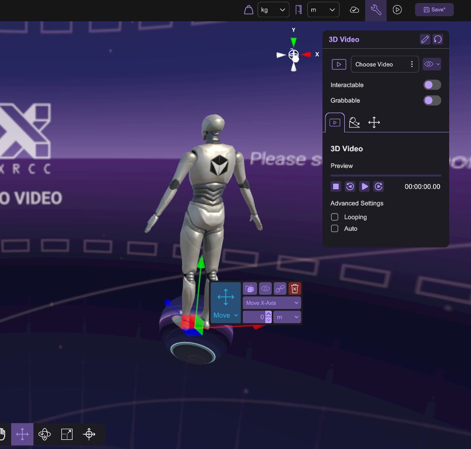
Interactable: You can toggle the "Interactable" checkbox to allow object interactivity during Play Mode. If "Interactable" is enabled, the object will be visible and accessible to the user during Play Mode. If "Interactable" is not enabled, the object will still be displayed in Play Mode, but users will not be able to interact with it.
-
Grabbable: You can toggle the "Grabbable" checkbox to allow a built-in grabbing interaction in Play Mode. However, "Interactable" need to be enabled to make the object grabbable.
If "Grabbable" is enabled, the user can grab and hold the object by long-press the right mouse button.
- Grab in PC Mode: You can grab and hold the object by long-press the right mouse button.
- Grab in XR Mode: You can grab and hold the object by pressing the Grap Button.
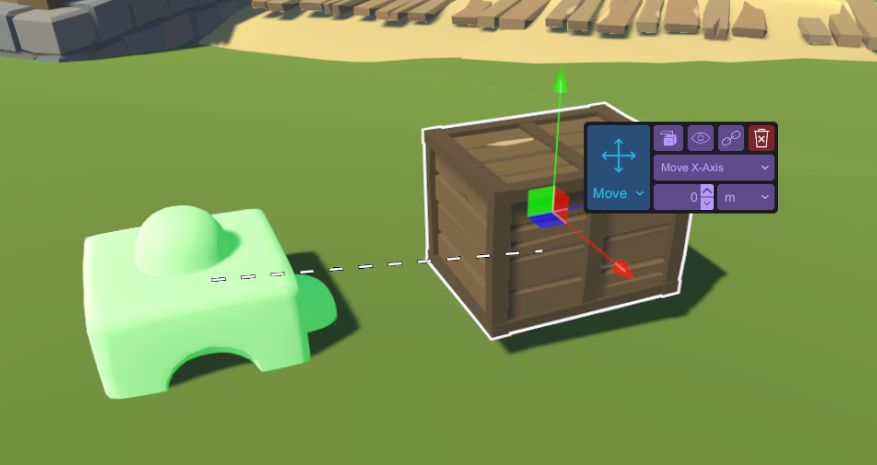
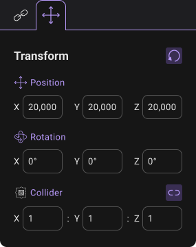
- Transform: You can configure the parameters of position, rotation, scale, offset to adjust the value of an object. Both aspects can be configure the X, Y and Z dimensions value. You can also press the average scale button to ensure the object can maintain the same size ratio when you adjusting the scale of the object. You can also press the reset button to let all parameters return to the default value.
Please refer to the XR Mode user guide for details of the grabbing action.
Physics Configuration
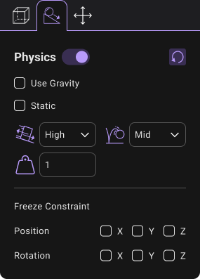
- Physics: You can toggle the "Enable" check box to allow physics-based interactions. If "Physics" is enabled, you can configure parameters like gravity, friction, bounciness, and mass to simulate physics in your Project to ensure that the objects correctly accelerate and respond to collisions, gravity, and various other forces.
| Physics settings | Description |
|---|---|
| Use Gravity | The object will be affected by the gravitational force, causing it to fall or move downward. |
| Static | The object remains fixed in place and does not move or react to physics forces. |
| Friction | Friction determines the friction, or the resisting force of the object when sliding on another surface. There are four levels in Configuration:Zero, Low, Mid and High. |
| Bounciness | Bounciness determines the bounciness, or the degree of elasticity exhibited by an object when it collides with a surface or another object There are four levels in Configuration: Zero, Low, Mid and High. |
| Mass | The mass value for a object indicates how heavy or light it is compared to other objects in the scene. |
| Constraint | Constraints restrict movement along certain axes. You can toggle “Freeze Position” or “Freeze Rotation” check box to disable movement or rotation in certain axes. Constraints restrict movement along certain axes. |
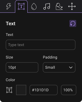
Text Object Configuration
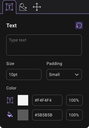
Text Object has the extra configuration of the display text, font size, padding, font color, and background color.
| Text settings | Description |
|---|---|
| Text | The text shown in the text box. |
| Font Size | Adjust font size. |
| Padding | Adjust the margin length between the text and the edge. |
| Font Color | Adjust font color. |
| Background Color | Adjust background color. |
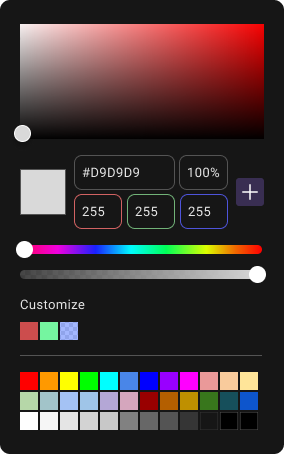
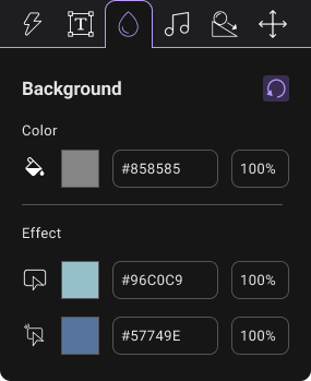
You can click on the color to launch the Color Panel for color selection. The font Color is preset as White (Hex-color: #FFFFFFFF, RGBA: 255,255,255,255). The Background Color is preset as Transparent Black (Hex-color: #00000000, RGBA: 0,0,0,0).
There is an 6 digit color code in the Hex-color box to set the color value. First two digit codes relate to Red color value. The third and fourth digit codes represent Green Color value. The last two digit codes represent Blue colour value. The text box next to the Hex-color box takes value of percentage which is the extent of transparency.
2D Image/Video Configuration
2D Image and 2D Video Object both has the extra configuration of Keep Aspect Ratio and Two-Sided.

If Keep Aspect Ratio is enabled, the default size of the object will follow the aspect ratio of the media asset instead of a square. If Two-Sided is enabled, the user can also see a mirrored image/video when viewed from the back instead of a transparent object.
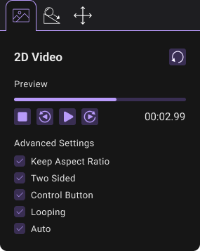
By default, the 2D Video Object has an extra configuration of "Control Button". You can toggle the "Control Button" option to enable the control buttons shown in the Play Mode.

| Button in Play Mode | Functions |
|---|---|
 | Rewind a portion of the video |
 | Play the video. After the “Play” button is clicked, it will automatically change to the “Pause” button. |
 | Pause the video. After the “Pause” button is clicked, it will automatically change the “Play” button |
 | Stop the video. |
 | Fast forward a portion of the video |
3D Image/Video Configuration
3D Image/Video has the extra configuration of setting its Image/Video Asset. The 3D Image/Video is represented with a sphere with a radius of 500m. It is better to spawn the 3D Image/Video at world origin to keep it aligned properly.


In Edit Mode, the 3D Image/Video spawned in the scene represents the 360 object. This is used for easy selection and will not be shown in Play Mode.
Document Configuration
Document Object has the extra configuration of Keep Aspect Ratio, Two-Sided, Selected Page and Show Button.

If Keep Aspect Ratio is enabled, the default size of the object will follow the aspect ratio of the media asset instead of a square. If Two-Sided is enabled, the user can also see a mirrored document when viewed from the back instead of a transparent object. The Page list controls the starting page in Play Mode. If "Show Button" is enabled, the user can see control buttons in Play Mode.
Point of Interest Configuration

You can toggle the "Set Active" option to activate the status of Point of Interest. If "Set Active" is enabled, the object will be shown in green color and the user can travel to the destination of Point of Interest. Otherwise, it will be greyed out. The Orientation of robot represents the direction the user will face after teleportation.
Button Configuration
| Action | Text | Background | SoundEffect |
|---|---|---|---|
 |  |  |  |
By default, Button object provides "Click" event in Play Mode. When it is clicked, it will trigger designed reusable action (See in Section "Action Configuration"). User can define Text content, background color and sound effect of the button. The configuration is shown below:
| Configuration | Function | Description |
|---|---|---|
| Text | You can change the text of button in Text Box. | |
| Font Size | You can change the Font Size of the text. | |
| Font Padding | There are four options of Font Padding: None, Small, Medium and Large. This setting determines the margin length between the Text and the edge of the Button. | |
| Font Color | You can open the Color Panel to change the color setting of Button text. | |
| Color | You can open the Color Panel to change the color setting of Button. The default color is white. | |
| Hover Color | The Hover Color provides an overlay color effect when the user starts pointing the Button. | |
| Select Color | The Select Color provides an overlay color effect when the user clicks the Button. | |
| Hover Audio | The Hover Audio provides a sound effect when the user starts pointing the Button. | |
| Select Audio | The Select Audio provides a sound effect when the user clicks the Button. | |
| Action configuration determines which action will be applied to the Button Click event. This part refers to Action Configuration in the following part. |
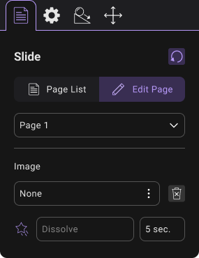
Slideshow 2D Configuration
| Page List | Edit Page | Advanced Settings |
|---|---|---|
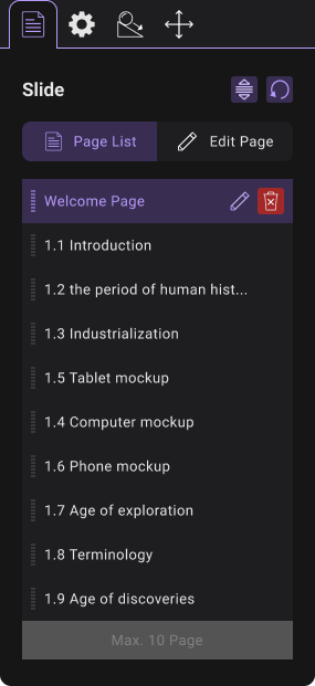 |  |  |
This object can provide a 2D slide show. The properties of the various settings are shown below.
| Configuration | Function | Description |
|---|---|---|
 | User can add and delete slides. The maximum number of the slides is 10. | |
 | Using dropdown in edit page, user can switch to configuring different slides. | |
| User can add Image Assets to Slide. | ||
| Duration time is the time interval between slides. | ||
| The Transition determines which animation will be applied for the transition of Slides | There are 6 animation which can be chosen:
| |
| If Keep Aspect Ratio is enabled, the default size of the object will follow the aspect ratio of the media asset instead of a square. | ||
| Two Sided | If “Two-Sided” is enabled, the user can also see a mirrored image/video when viewed from the back instead of a transparent object. | |
| Control Button | If “Control Button” is enabled, the control buttons will be shown in the Play Mode, including Play, Pause, Stop, Last Slide and Next Slide. | |
| Progress Bar | If “Progress Bar” is enabled, there will be a bar displaying the progress of Slide show. The duration time is the same as “Duration” configuration. | |
| Auto | If “Auto” is enabled, the slides will be shown automatically and repeatedly. | |
| Enable Caption | If “Enable Caption” is enabled, the caption text will be shown below the 2D images in Play Mode. |
Slideshow 3D Configuration
The function of Slideshow 3D Configuration could refer to 3D Image Configuration, except Slideshow 3D Configuration could provide slide show of multiple images.

This object can provide a 3D slide show. The properties of the various settings are shown below.
| Configuration | Function | Description |
|---|---|---|
| User can add and delete slides. The maximum number of the slides is 10. | |
| Using dropdown in edit page, user can switch to configuring different slides. | |
| User can add 3D Image or Skybox Assets to Slide | ||
| Duration time is the time interval between slides. | ||
| Auto | If “Auto” is enabled, the slides will play automatically and looping. |
Under 3D Slide Show, users can add slides and add slide images. Duration time could be set to control the time interval between slides.
The 3D Slide show is represented with a sphere with a radius of 500m as shown in the image.
Light Configuration
Light Configuration provides light resources in the play mode.
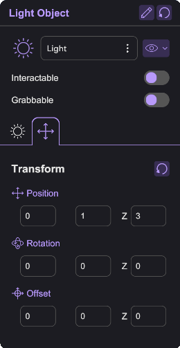
There are three types of light.
| Light Type | Description | Common Feature | Unique Feature | |
|---|---|---|---|---|
 | It creates a cone-shaped region of illumination with a specified angle and range. | |||
 | It behaves like the sun, illuminating all objects in the scene from the same direction without diminishing over distance. | |||
 | It sends light out in all directions equally.The intensity diminishes with distance from the light, reaching zero at a specified range. | |||
Light is resource-intensive object and might largely impact playback performance, especially in XR
Option Box Configuration
Option Box allows users to create an info panel (when option set to None), a selection menu, a MCQ panel.
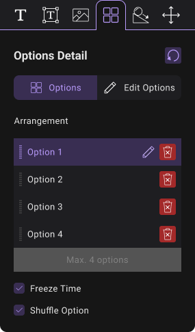
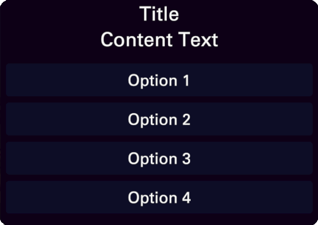
Option Box is composed of three sections, Title, Content and Option.
| Tab | Function | Description |
|---|---|---|
| The text shown in the title box. | ||
| Adjust font size. | ||
| Adjust the margin length between the text and the edge. | ||
| Adjust font color. | ||
| Image could be set as image background. | ||
| Adjust background color. | ||
| The text shown in the content box. | ||
| Adjust font size. | ||
| Adjust the margin length between the text and the edge. | ||
| Adjust font color. | ||
| Image could be set as image background. | ||
| Adjust background color. | ||
| Optional: The Image shown in the content box. | ||
| The arrangement of the option could be list or grid. | ||
| The action to trigger when the option is clicked. | ||
| The text shown in the option box. | ||
| Adjust font size. | ||
| Adjust the margin length between the text and the edge. | ||
| Adjust font color. | ||
| Image could be set as image background. | ||
| Adjust background color. | ||
| Color of the box when it is not selected or clicked. | ||
| Color of the box when it is pointed at with the wand tool. | ||
| Color of the box when it is clicked. | ||
| Audio played when the box is pointed at with the wand tool. | ||
| Audio played when the box is clicked. |
Action configuration
Actions are events that can be remotely triggered by other objects. More detail can be found in Create Re-usable Behaviour using Action session.
Add Real-World Tracked Entity to Scene
An Entity is an object that can follow the position and rotation of trackers in the real world, such as Vive Tracker, Controller and HMD. We can connect an entity with a given tracker so the entity will always update its position and rotation with the tracker. However, an entity is an empty object. It does not include any model. We still need to link the model we want to the entity.
Add Entity to Scene
Launch the Tracking Entity Setting Panel by clicking the "Entity Setting" () icon.
In Tracking Entity Setting Panel, toggle the Entity 0 switch to turn it on. Also, the user can change name using the rename button.

Attach Object to Entity
Select an Object, then use the "Link to another item" () (Ctrl + L) to link it with the Entity. It can link up multiple items to a single Entity.
Configure Entity
Select the Entity and open the Inspector. You will see the properties we can modify, including the position, rotation, and collider, as well as the list of linked items.

- Linked Items: A list of items linked to the entity.
| Linked Items | Attribution | Description |
|---|---|---|
| The linked items will hide in CAVE and Dome but will show in HMD and PC environment during playback | ||
| The linked items are always shown. | ||
| The linked items are always hidden. |
Scene and User Configuration
For the detail of scene and user configuration, please refer to Configure Scene Setting.